

Beige has long been a go-to color for homeowners, known for its reliable neutrality that fosters a cozy atmosphere. However, it can become predictable and lack visual interest, particularly when overused.
Designers are now leaning towards more intricate color trends that maintain the comforting essence of beige while introducing richer, layered tones full of depth. These selections are not overly bold but offer a refined sophistication that breathes life into interiors.
If you're seeking a refreshing departure from beige without straying too far from neutral tones, consider these five stylish shades that are both timeless and unique.
1. Cola Browns

A dining area designed by Of Place Studio showcases rich greens, natural wood, and terracotta accents that complement the dark walls.
Cola browns are gaining traction for their luxurious depth. Paint brand Benjamin Moore has even highlighted 'Silhouette' as the color of the year for 2026, a captivating blend of chocolate and charcoal.
Amy Knerr, principal designer at Of Place Studio, notes, 'The red undertones in cola brown enhance the coziness of smaller spaces, enveloping them beautifully.' This color is versatile and luxurious, shifting in hue throughout the day to create a warm, inviting atmosphere.
Amy recommends pairing cola browns with rich marbles, warm wood tones, and heavy textiles to enhance the overall comfort of the space.
2. Soft Mauves

Interior designer Anna Haines used a two-tone design in this entrance hall, juxtaposing aubergine woodwork with soft mauve walls for a calming yet intriguing space.
While purple can be tricky in decor, soft mauves present a sophisticated option. Warmer than greige yet cooler than pink, it's an ideal choice for a neutral that feels rich without being overwhelming.
Anna explains, 'Mauve brings the softness of beige, but its subtle plum undertones add depth and warmth, allowing it to shift beautifully with changing light.'
This color serves as a neutral backdrop that complements bold artwork without overshadowing it. Pairing mauve with textured materials adds to its relaxed feel.
3. Butter Yellows
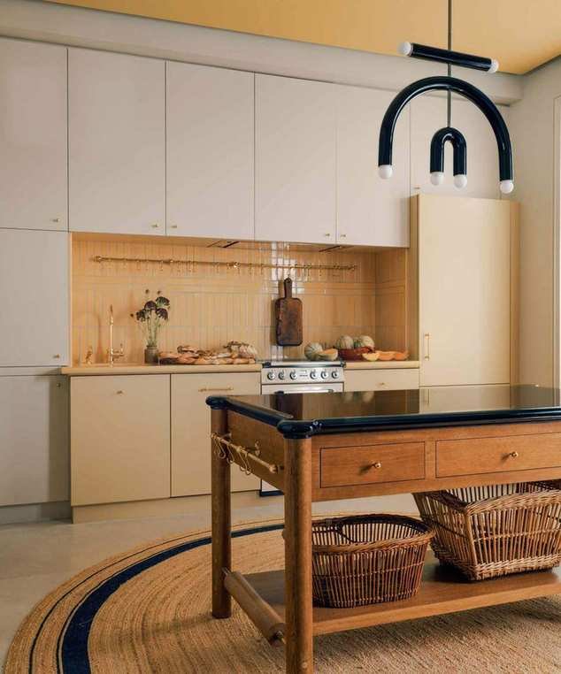
The India Yellow ceiling in this Paris apartment designed by Jessica Helgerson draws attention upwards.
Soft buttery yellows radiate warmth and positivity, making them perfect for cooler spaces where beige might seem dull.
Jessica Helgerson, principal at Jessica Helgerson Interior Design, states, 'Using yellow can infuse joy into a recently remodeled Paris apartment, creating a warm ambiance throughout.'
She highlights the delightful combination of Farrow & Ball India Yellow and rich furnishings to create a sophisticated French aesthetic.
4. Muted Greens

In this kitchen by Blank Slate Interiors, soft sage green cabinets add depth and openness to a small area.
Muted greens, with their earthy tones, bring vibrancy that beige often lacks. Bari Jerauld of Blank Slate states, 'These greens embody warmth without feeling cold, drawing inspiration from nature.'
She incorporates earthy greens in her projects to create timeless, spacious environments. This muted green choice can make small areas feel larger and more inviting.
Bari emphasizes that muted greens work beautifully with natural materials, enhancing the warmth of wood and brass accents.
5. Muddy Pinks
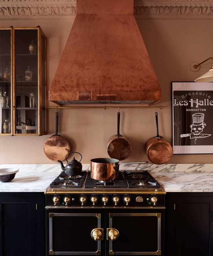
Farrow & Ball's Setting Plaster creates a warm and inviting backdrop in deVOL's kitchen design.
Muddy pinks are a favorite among designers for their sophisticated, understated charm. This hue offers a nuanced alternative to sweeter pinks while being gentler than beige.
John Law, creative director of Woodhouse & Law, explains, 'The key lies in varying textures and finishes, allowing muddy pink to showcase its depth across different surfaces.'
In this deVOL kitchen, the earthy pink walls create a chic, contemporary atmosphere when paired with darker cabinetry. 'We often use soft pink tones like Farrow & Ball's Setting Plaster in our showrooms, balancing color without overwhelming the space,' says Helen Parker, creative director at deVOL.
Helen also believes that muddy pink pairs beautifully with black, creating a striking contrast that feels modern and inviting. Copper accents further enhance the warmth of this color palette.
Explore These Colors
All these paint colors share a muted complexity that sets them apart from the flatness of beige. They offer depth and character, transforming spaces into inviting havens as the light shifts throughout the day.

